How does the amount of light and dark affect the overall design?
The two images you see on the right are almost the same, except that the top illustration is made on a white background, and the bottom one is on a black background.
The final result is so different!
I’ve spent this week exploring the effects of light and dark on the overall design. I looked at not only the amount of light and dark in a picture, but also at their size and shape, and the corresponding results.
This is Week 8 of my drawing challenge to learn how to draw kawaii in 6 months.
Light and Dark Exercise
To get a feel for how light and dark influence the design, I drew a few patterns with different amounts of light and dark.

From this I learned that darker designs feel heavier, but also bolder. It depends on the purpose of the illustration, I guess.
I also observed that if the white circles are clustered together, the design appears lighter, since our eye combines them in our mind into one large light shape.
The two large circles on the right have about the same amount of light and dark (50%-50%). But they look very different! So I concluded that the shape of the light and dark areas also matter.
Here is another example. The two squares below are filled with exactly the same amount of light and dark, half and half. However, the overall impression from each of the squares is different. The square on the left (with stripes) feels sharp and very high contrast. The eye slides up and down the stripes. The square on the right (with triangles) feels more enclosed, the eye circles around the square. This design is more fragmented with dark areas appearing in patches. It feels softer and more symmetrically balanced (even thought it’s not!).

Three Illustrations With Light and Dark
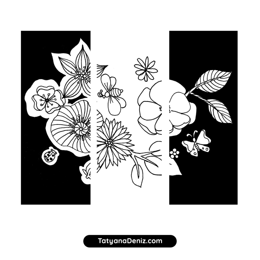
Next, I decided to make the same illustration of flowers three times, and apply a different amount of light and dark to each one. For the first one, I filled all spaces around the flowers with black. For the second, I filled only half the space (well, at least that was the plan) with black, leaving some white space around the flowers. And for the third, I just did the outlines.
Let’s look at the design outcome for each of those illustrations.
First version with two-thirds of the area dark

This design looks bold and high contrast, even heavy. It takes a lot of guts (at least for me) to decide to fill this much area with black. I guess, that’s why it’s appears bold :).
Another thing to note is that it takes a LONG time to fill around all those little spaces and petals. Something to consider. To make colouring faster, I used a smaller size pen to fill around the petals, and then a large brush pen to just “go for it” and cover large areas. The rule of thumb is, use the biggest pen size that can do the job.
Putting black around white areas makes white appear smaller. I found out the hard way! The flowers and leaves in the illustration above look kind of skinny. Moral of the story — if you are planning to make the background dark, draw the light elements larger than you think they need to be.
Second version with half of the area dark

The goal for this version was to make the light and dark balance 50%-50%. In the end, it appears to still be pretty dark, even when only half the are is dark… Maybe it’s because the dark area is all solid?
In this case the dark area around the flowers is helping the eye group the flowers and leaves together, creating visual hierarchy. It guides the eye into the centre and around the illustration.
Third version with only the outlines

This version looks light and simple. It’s like a lace design. But it also doesn’t show any visual hierarchy or clear point of focus. Everything is done in the same line. I still like it though, it looks decorative.
As you can see, even though the content of each of these three illustrations is the same, the overall mood is very different. The only thing that changed was the amount of light and dark in each illustration.
What Is NOTAN and How To Use It
Turns out, I am not the first to observe this concept of light and dark :). In my research I found that there is a composition design technique called notan. Notan is a Japanese word (of course!) for the balance of light and dark. Hey, I should have called this blog post Notan!
Here is how it works. Before creating an artwork (or kawaii composition), you first create a few sketches using only black and white shapes to explore composition. This way you are not distracted by the effort of getting the drawing right, and you can just focus on the layout. Then you select the best composition and use it for your artwork.
Let’s look at an example. Below is a photo of a landscape, followed by six notan sketches by Richard Robinson of the same scene.


Each of the six notan sketches shows a different view of the same landscape. From this the artist can select the composition that best fits the message of the artwork.
Zentangle Designs with Varied Light and Dark
To conclude, I created a gallery of Zentangle designs arranged from lightest to darkest. I used these somewhat abstract designs to understand how light and dark areas influence my feeling about the design.


Materials Used This Week
- Micron pen, size 04, black
- Tombow dual brush pen, black
- A5 sketch pad (I am still traveling, so I am using a sketch pad instead of just pieces of paper)
Full disclosure: I personally own and use all of these. If you buy anything using my links, Amazon will pay me a small commission (no cost to you – thank you!). But if you normally shop somewhere else, it’s totally ok too.
Drawing References
- Pinterest search for Zentangle
- Zentangle & Tangle Pinterest board by PicCandle
Drawing Time Diary
Monday, Jan 2: no drawing
Tuesday, Jan 3: two sessions, 20 mins, 30 mins
Wednesday, Jan 4: one session, 45 mins
Thursday, Jan 5: one session, 30 mins
Friday, Jan 6: two sessions, 30 mins, 30 mins
Saturday, Jan 7: no drawing
Sunday, Jan 8: no drawing
Total drawing time: 3 hr 5 mins
Do you have anything to add? Let me know in the comments!
Read all about my 6-month drawing challenge and track my drawing progress week by week.
