Why do some images grab our attention and others don’t?
I have spent the past week analysing how images get noticed. A lot of it has to do with outlines, which help the picture literally pop off the page and into our head.
I was walking by a cafe, and as I passed it I had a mental image of a delicious banana milkshake in my mind. I even started to salivate, ha. So I had to go back and look at the window display to see how this piece of communication entered my mind.
Sure enough, there was a blackboard with a doodle of a smiling banana milkshake. But that wasn’t all. It was outlined 4 times!!! In various ways, one of them in neon colour. It make have looked tacky, but it sure did the job! It made me look.
Same with this kawaii artwork on the right by Charuca. It’s already a very happy illustration, but having various outlines really makes it pop.
Below is my study of outlines for Week 6 of my drawing challenge to learn how to draw kawaii in 6 months.
Why Use Outlines
Outlines help guide the eye around the artwork and tell us what is important. This is called visual hierarchy.
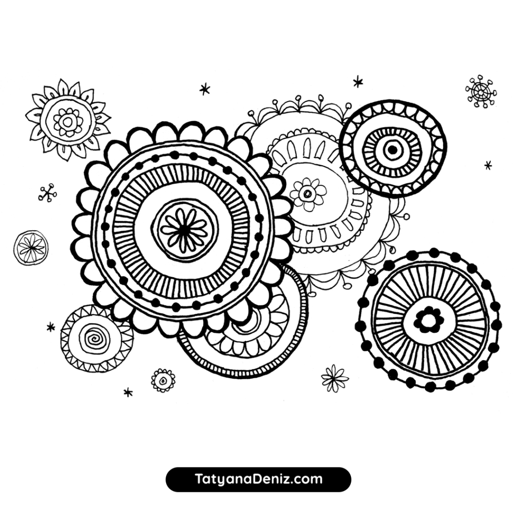
Also, thick lines make the object appear closer, while thin lines move the object farther away and into the background. You can use this effect to create depth in your drawings. Like I did with these circles:

How to Make Outlines Work
You can’t just slap a fat outline around the character, as I’ve found out. The outlines have to be selective to best tell the story of the drawing.
Here is a drawing I did of a kawaii cupcake. It looks sweet, although you can’t really tell the main subject of the drawing. There is no visual hierarchy.
Here is the same drawing with the cupcake outlined. It communicates the subject much better.
It would take a lot more outlining to make this drawing really pop, but I just wanted to show an example of how an outline draws attention to the subject.
A few more tips for effective outlines:
- Most simply, give a thicker outline to the main subject. Usually, it’s the kawaii character. The objects around the character have thiner outlines, and background elements are even thiner. This is a way to create visual hierarchy in the drawing.
- You can add secondary (thiner) outlines inside the main subject to visually separate different sections. For example, in the cupcake drawing above I added a thicker outline below the frosting and right at the edge of the cupcake liner.
- Select 2 or 3 thicknesses and use them consistently, instead of having a different thickness for every object.
- Make the outline thickness REALLY different. For example, I used Micron 0.4 for very thin lines, Tombow Brush Pen for medium thickness, and Artline 70 marker (like a Sharpe!) for really thick lines (use bleedproof paper with Artline 70, because it really goes through the paper).
- Add more than one outline, if it helps tell the story. Here is an example of multiple outlines from Charuca:

Gallery of Kawaii Outlines That Work
Here are a few examples I found, where outlines help to communicate the message of the artwork. And make it look good too!


Materials I Used This Week
- Artline pen, size 04, black
- Artline 70 marker, size 1.4 – for the really thick outlines!
- Micron pen, size 04, black
- Bleedproof paper
- Printer paper for no-pressure sketching
- Pencil, eraser
Full disclosure: I personally own and use all of these. If you buy anything using my links, Amazon will pay me a small commission (no cost to you – thank you!). But if you normally shop somewhere else, it’s totally ok too.
References
- Manga for the Beginner Kawaii book by Christopher Hart
- Creative Doodling & Beyond book by Stephanie Corfee
- Artworks by PicCandle
- Artworks by Charuca
Drawing Time Diary
Monday, Dec 19: three sessions, 15 mins, 15 mins, 30 mins
Tues, Dec 20: two sessions, 5 mins, 55 mins
Wednesday, Dec 21: one session, 30 mins
Thursday, Dec 22: no drawing
Friday, Dec 23: two sessions, 25 mins, 30 mins
Saturday, Dec 24: no drawing
Sunday, Dec 25: no drawing
Total drawing time: 3.5 hours
Have you found any images with outlines that work? Link to them in the comments!
Read all about my 6-month drawing challenge and track my learning progress week by week. Thank you for your support 🙂
