The topic for Week 21 of my 6-month drawing challenge is storytelling.
Storytelling to share wisdom that has been around as long as humans. Maybe longer! These days we don’t sit around the fire to share our stories (sadly), but we have another powerful channel: SOCIAL MEDIA.
Every piece of content we put out there is a form of storytelling, intended or not. As artists, that’s what we do. We tell visual stories. So we might as well get good at telling the stories we actually want to share with the world.
Below are 10 powerful tips to punch up your storytelling. But first, let’s look at what is a story.
What Is a Story

A story in its simplest form goes like this: take a sad face and turn it upside down. The hero is experiencing a conflict, and the story tells us how the conflict is resolved. And hopefully we learn something from it :).
Telling stories is a way to “teach them as if you teach them not”, to convey ideas without explicitly stating them. This is so much more powerful, that just saying the lessons directly. It leaves a much deeper impression.
Here is another formula for telling a good story:
- Put a man up in a tree
- Throw rocks at him
- Take the man down from a tree
There you have it. Now let’s see how we can apply powerful storytelling to our drawings and illustrations.
1. Understand Your Motivation for This Drawing
As you sit down to draw, ask yourself if you want to make a statement with this drawing? Or are you just going to let your mind wonder and see what comes out?
Either form of drawing is valid, of course! If you are doing “stream of consciousness” drawing, you can come up with something really beautiful and interesting, and a story may develop out of this. Or it may reveal things about you that you didn’t even know. Great!
But if you are drawing to make a statement, you need to plan it differently. You need to be crystal clear on what point the drawing will make, what you want to say with it. Because if you are confused about the message of your drawing, so will be your audience!!
2. Remove Everything Not Relevant to the Story
Now that you know what your message is, eliminate the fluff. Clarity over cleverness. Follow the advice of a great Russian playwright Anton Chekhov:
If you say in the first chapter that there is a rifle hanging on the wall, in the second or third chapter it absolutely must go off. If it’s not going to be fired, it shouldn’t be hanging there.”
– Chekhov’s gun principle
Keep the scene crisp, clean and relevant. Why is this object there? “Because it looks good” is just not a good enough answer ;). If it looks good – fantastic! Keep an object there, but make it relevant to the story. If there are stars floating around the character, is it because he bumped his head and is “seeing stars”? Or is there something giving off star-sparks?
Every element is a chance to tell the story more deeply. Use it!
3. Move the Eye Around the Drawing
Every story has a beginning, a middle and an end. A single illustration is like a still frame of a moving film, but it still has a story sequence within it. You as the artist design the sequence. Where do you want the viewer to look first, second, third… that’s how the story unfolds.
Use devices such as areas of light & dark and colour contrast (if the drawing is in colour) to move the eye around the picture.
Zainab Khan (PicCandle) does this really well. She includes mini stories all around the page, and keeps the eye moving from story to story. In the illustration below, the windows have dark backgrounds, which draws the eye from window to window.

4. Build on Familiar Stories and Themes
What are some of the truisms for your audience? Hopefully you know a lot about your audience (if you don’t, ask them!). You can speak to their psyche. You are not looking to manipulate anyone. Instead, you are looking to deliver your message in a way that will be most understood.
Alison Wong from NewMomComics created a comic book about being a new mum, and what to expect in the first year. I just went through this with our son, and I soooo understand every one of them! This is an example of excellent storytelling by a mum to other mums.

5. Use Costumes, Objects and Accessories
Tell a colourful story, in which your characters are dressed and accessorised appropriately. This may require some research. For example, imagine you are drawing a victorian-style lolita. You don’t need to guess or imagine what victorian dress looks like. Look it up! Also, what kind of shoes will she wear? What kind of hairstyle? What kind of purse?


I have written a number of posts about how to draw clothes, accessories and relevant objects for kawaii drawings. Check them out for a more in-depth discussion.
6. Appeal to the Senses
To make the story extra rich, go beyond just sight. Cover touch (using textures), smell (show me that steaming cup of coffee, and you got me!), taste (make us salivate like Pavlov’s dogs).
But how can I appeal to hearing if I am making a drawing? An excellent question. We hear music and we are deeply moved by it. Draw a few note symbols, and you have hearing covered.

7. Who, What, Where, When and Why
This is the principle of the 5 Ws. Your drawing should answer these 5 questions (or as many of them as possible). Especially the “WHY”. Why does this image exist?
Even as you are drawing, scan the image and ask yourself, “Have I explained who the character is? If she is an artist, could I place a pencil in her hand to make it clear?”
Let’s look at a good example of setting the scene and answering the 5 Ws by Jerrod Maruyama.

WHO – the toaster, mainly, but also bread, butter and beverages
WHAT – the bread is burnt and everyone is upset
WHERE – breakfast table, kitchen
WHEN – morning
WHY – we’ve all had this happen before. Excellent breakfast plans, fresh juice and a glass of milk. But the toaster was set a little too high and the toast is burnt. We have to start all over again. And if it’s a good day, we still have more bread to toast. But if it’s a bad day, we will have to slurp the butter by itself and chase it with a juice.
I must add that the title of this illustration plays a big role in telling the story. Well done.
8. Don’t Strive to Be New, Strive to Be Good
Nothing we create is truely new anyway. Creativity is simply taking two existing ideas and combining them in a new way.
When we examine every great piece of art or invention, we can see that it is standing on the shoulders of other great ideas and inventions that lead to its createion.
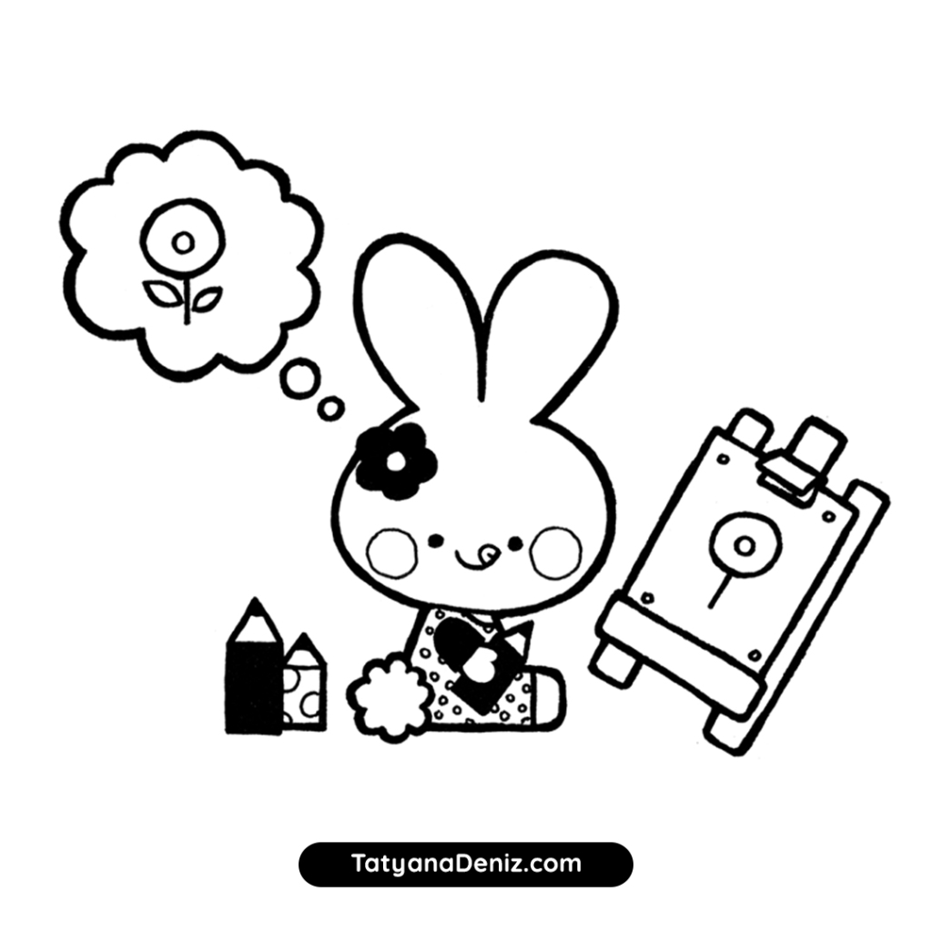
Use illustration ideas that are proven to work and populate them with your own stories and characters. Let’s look at a drawing of a kawaii bunny I did, and examine how I arrived at it.

This drawing is a result of three visual references (below) combined in a new way, plus my own experiences.

Here is how I used the references:
- A scene from Hello Kitty drawing book for overall layout and easel drawing
- A collection of bunnies from Pinterest for character head shape
- A page from Owly book (“Flying Lessons”) for that face of joyful concentration wth the tongue sticking out
Then I infused the sketch with my own story of a bunny drawing a flower from memory. Drawing from memory is something I am working on myself, and many of my drawing friends have mentioned it as a challenge as well. This topic is relevant to my audience.
9. Now That the Drawing is Clear, Get Clever!
I know I said clarity over cleverness, and this is still true. Get the message of the drawing clear first. But if that’s covered, you can get clever and even more potent.
This is one of my all-time favourite examples of clever illustration. It’s from A List Apart article about responsive web design (web page design should adapt to the size it is viewed at).
When you read the blog on the desktop, the blog cover looks like this:

When you are on an iPad or phone, the blog cover looks like this:

That blog cover pretty much sums up the whole point of the post. It’s subtle, clever and entirely to the point. The author of this illustration is Kevin Cornell.
10. Get Feedback on Your Drawings
Show your drawing to someone who hasn’t see it and ask them, “What do you think is this drawing about?”
It’s a very scary thing to do! You might not like what you hear.
Prepare yourself for whatever response that comes back. If the person looks puzzled, that does NOT make you a bad artist. It simply means that you need to go back to the drawing and re-work it.
Most people don’t ever do that. They just draw, hoping that the result will be understood by the world. Do this step, and you will be ahead of 99% of illustrators out there :).
Materials I Used This Week
I have been experimenting with Rapidograph pens on vellum paper. The ink flows like butter on vellum surface, unlike using it on bleed-proof paper, which just makes it buckle.
However, I went back to using my usual Micron and Copic pens, as I found it difficult to produce a precise line with Rapidograph pens. Perhaps I need more practice!
These are the pens I used for most of my drawings this week:
- Artliner Pen, black, size 0.4
- Micron Graphic Pen, black, size 1
- Copic Multiliner Pen, black, size 0.3
- Tombow Dual Brush pen, black
Full disclosure: I personally own and use all of these. If you buy anything using my links, Amazon will pay me a small commission (no cost to you – thank you!). But if you normally shop somewhere else, it’s totally ok too.
Drawing Time Diary
Mon, April 3: 1.5 hours
Tues, April 4: no drawing
Wed, April 5: 2 hours
Thur, April 6: 1.5 hours
Fri, April 7: 2.5 hours
Sat, April 8: no drawing
Sun, April 9: no drawing (blogging)
Total drawing time: 7.5 hours
Next week I will write about narrative – a very close cousin of storytelling, but with emphasis on sequence. Be sure to come back next Sunday, April 16th, to check it out! Subscribe to my newsletter to receive exclusive kawaii updates, tips & tricks.
This post is Week 21 of my 6-month drawing challenge. Draw with me and track my progress week by week. Thank you so much for coming!! ♥
