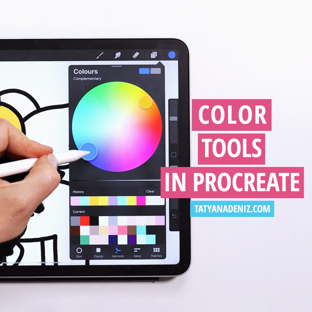
In this post you will learn how to use color tools in Procreate. We will look at how to choose colors, use color palettes, and how to color line art in the most effective way.
If you are just starting to draw in Procreate, I recommend these 2 accessories to make your drawing experience more enjoyable.
- PaperLike Screen Protector to add resistance to the drawing surface and make it feel more natural (like paper!)
- Huion Artist Glove so you don’t accidentally trigger any Procreate gestures with the palm of your hand
Full disclosure: I personally own and use all of these. If you buy anything using my links, Amazon will pay me a small commission (no cost to you – thank you!). But if you normally shop somewhere else, it’s totally ok too.
Here is my full step-by-step video tutorial on how to use color tools in Procreate:
Grab your iPad, open up Procreate app, and let’s get started! 🙂
How to Work with Color Tools in Procreate
To get started, open a blank document. Once you draw a shape, you can drag and drop colors into that closed shape.
For example, if we draw a sun, we can select the color we want and drop it into the closed shape (the circle).
If we decide we want to make the center of the sun a little bit more orange, you can go to your palette, pick a different color of orange and drag and drop it right onto the first color you chose and it will re-color it for you.
Another way to change color of your drawing is by using the adjustments menu in the top-left corner. Here you can adjust the hue saturation and brightness at the layer level!

The saturation settings are how intense the color is, and the hue changes the entire color to variants of its original tone.
How to Color Line Art in Procrete
Lets look at how to choose colors and color a line art drawing. Line art doesn’t have closed shapes, so what we need to do is to simply outline the shape that you want to fill and drop the color into it.
Now, of course, you can color each space individually, but it takes longer.
You can color each section of the drawing in this way. 🙂
What if you want to change some of your color choices? Well, there are easy color tools in Procreate to do exactly that, and let me share some tips and tricks to make it easier.
Procreate Tips and Tricks for Color
Put each color on its own layer so that you can later use the adjustments menu to change the hue and saturation of your colors.
For example, you might decide that you want one color of the drawing to appear brighter than the rest, or change it altogether.
But because your two color pieces are on the same layer, you won’t be able to adjust them individually as we did in the beginning. But when you use separate color layers for each color, you can change each color layer using the Adjustments menu.

How to Select a Color using Color Tools in Procreate
Let’s take a quick tour of the color options in Procreate. There are 3 different ways you can select a color.
When working with color, there are three variables that you’re always controlling: hue, saturation, and value.
Hue is the actual color you choose.
Saturation is how intense or colorful the color is.
Value of how light or dark the color is.
Select a Color Using the Wheel
The first way to select a color is the wheel way. Depending on what direction you go in the wheel, you can change the overall hue, saturation and value of the color.

Select a Color Using the Standard Square
The second way is by using the standard square view, similar to what you see in Photoshop. It’s common in graphic design, but works the same way the wheel works. By dragging your cursor, you can affect the colors hue, saturation and value. It’s exactly the same.

Select a Color Using the Hexadecimal Code
Then the final option is using a hexadecimal code. The code works great if you’re following a brand guide and you have an exact code for the color you need to use. While I don’t use this option very often, I can see how it can be a great addition for graphic designers.

Color Tools in Procreate for Color Harmonies
When working with colors, try using the harmony option. It was added to Procreate in the latest update and adds a really cool dimension to your drawings. If you’ve been drawing for a while, you’re probably familiar with complementary colors and analogous colors.
Complementary colors are the complete opposite of each other. Using the harmony tool, Procreate will show you the complete opposite color for you to use if you wanted that design.
For example, if you’re using orange and wanted the opposite color, then the harmony tool would show you a variation of blue as the opposite. You can save these combinations and add them to your palette as we did before.
Analogous colors are next to each other. When you’re using the harmony tool, and you select a color like a teal, Procreate will show you two similar colors to use in your drawing. Together these colors will always harmonize and work well.
Once you found a combination you like, you can save it to your palette. To do this, you tap on the large circle in the middle, which will make it your active color in the top right, and then you can add it to your palette. You can repeat these steps for the other two colors in your harmony.
How to Set Up Your Procreate Coloring Layers
Here is how to structure coloring layers to give you the most flexibility in your drawings. This will allow you to experiment and create different colorways and find the best color combinations for your design.
To show you the best way to do this, I’m using a slightly rendered drawing of Ariel. The hair in the picture has a base color, shadows, highlights and undertones. As I mentioned before, you want to start by making sure each color has its layer.

Method 1: Sample Your Base Color and Adjust
Once you’ve selected your base color, you can sample it to find the color for the highlights and shadows. To do this, you can tap and hold to see both the original color and the one you’re selecting.
For the shadow, you want to select a more saturated and slightly darker color. When choosing the color for the highlights, it’s the same process. You want to start by sampling the color and then selecting a color that’s lighter and less saturated.
Method 2: Use Layer Blending Modes
Another great way to find the perfect color combination is to use the blending mode. To show you how this works, I’ve created the shadows of Ariel’s hair using a grey color. While this looks far from perfect, we’re going to work this color using different blending modes.
First, we’ll start by dropping the opacity, but it will likely still have a grey-ish hue. The blending mode features will allow us to see the best option for how the layers interact. To find the perfect combination, you’ll continue clicking through the modes until it looks the way you want.
Then for making it lighter, you can do the same thing, but with white. There, you will go and look at options like lighten, screen, color dodge, or add.

You can’t predict how it will look, so keep trying different ones to see which one you like.
More Procreate Tips and Tricks
If you want to learn about color tools in Procreate, you also find these Procreate tips and tricks extremely useful:
- How to draw smooth lines in Procreate
- Molang guided step-by-step drawing tutorial
- How to get started with digital art
Also, check out my YouTube channel for more tutorials!
Become a Kawaiian!
I would absolutely love to see your drawings created in Procreate. Join our warm and welcoming kawaii community in the Facebook group and become a Kawaiian!
Share the Love
If you found this Procreate coloring tutorial useful, please share it with your friends using the buttons below. Let’s spread the love of creativity and kawaii. 🙂
