
Learn how to draw this kawaii pun with elements of graffiti style in Procreate. Even if you are a beginner, you will be able to follow this easy step-by-step drawing tutorial, because I show you ALL the steps, as well as give you the thought process for creating this cute kawaii pun.
👉 CLICK HERE to Pin This Tutorial 👈
👉 CLICK HERE to Pin This Tutorial 👈
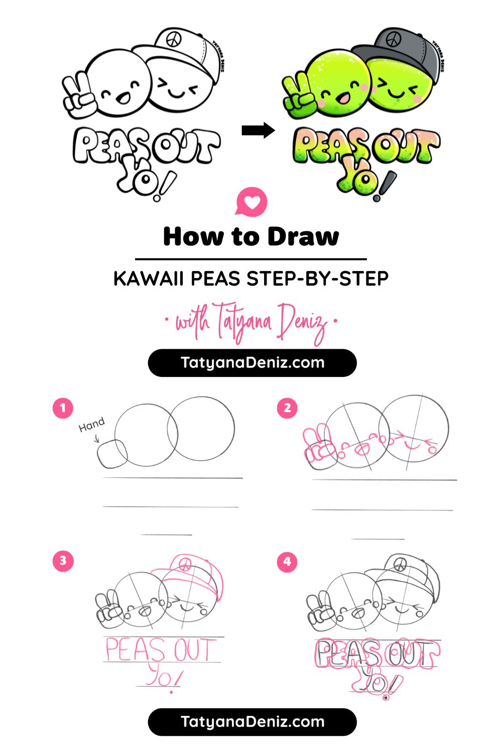
Step 1: Sketch the Character
The drawing process we’re about to explore is relatively straightforward. However, the real focus of our attention lies in perfecting the lettering that accompanies the drawing. Let’s jump right in and work through the details together.
For sketching, we’ll be using a pencil brush, quite similar to Procreate’s “Derwent” brush but with a few personalized tweaks.
If you’re want the EXACT brush I am using, you can download my signature brushes here.
I’ve set my pencil brush to a 54 size.
Tip! You can save your brush sizes by tapping the + on the brush size slider.
Now, let’s establish a reference point for our drawing.
This reference point involves creating a circle. After drawing it, hold your pencil, and Procreate will complete the circle for you.
Place your finger down to get the desired size, and if you need to adjust it further, simply tap the top and continue editing.
If you want to ensure consistency, you can duplicate the circle easily by doing a three-finger swipe down.

Next, let’s consider overlapping elements within our drawing. To create depth and dimension, we’ll make one element, in this case, our pea overlap another. You can erase any unwanted parts with the eraser tool, which I prefer to use with a smooth outline.
Let’s Give Our Characters… Character!
In our drawing, we’re introducing additional elements, like a hat on top of the pea. Drawing intricate hats can be challenging, so having a reference image can be immensely helpful. This hat wraps around the pea contributing to a streetwear-inspired vibe.
Our entire drawing is a fusion of graffiti, street art, and Kawaii styles. Yes, I believe these styles can co-exist! 😆

Moving on, we’re sketching a hand making a peace sign. While it may not look perfect in the initial sketch, don’t worry; we’ll refine it later.
This process involves figuring out the right size and position. Working on separate layers allows for easy adjustments.
Composition is vital, and we’re already thinking about it. Shifting elements slightly to balance the available space can make a significant difference.
To do this, we’ll select all the layers we’ve used so far, reposition them, and leverage Procreate’s snapping feature to help center everything.

Step 2: Hand-letter the Graffiti Text
Now let’s tackle integrating text elements into our drawing. Treat text as an integral part of your composition, just like the hand or the hat.
As for the text element, it’s important to remember that text is essentially just another shape within your drawing. Much like the hand or the hat, it’s about playing with shapes and forms. Text, often seen as intimidating by some, is more approachable than it seems. I’d like to give a shout-out to Stefan Kuntz, whose hand lettering course greatly boosted my confidence in this aspect.
For our text, we’ll use the phrase “peas out,” adding a little “yo” to complement the street vibe.
The challenge is to ensure that the letters are well-placed and don’t scatter. To tackle this, consider writing out your word separately and counting the letters. In this case, we have eight letters (including the space), so the halfway point should be right after the ‘S’.

Now, you can start sketching out the letters, deciding their size and thickness. Alignment is crucial; think of it as creating a stage for your piece. The text should balance and enhance the overall composition. In my case, I’ll go for a graffiti style, making the letters chunky and overlapping.
Add Dynamic Elements
Once you have the basic lettering blocked in, it’s time to add some dynamic elements. Create a new layer for the “yo” part, making it dynamic and adding an exclamation mark for extra flair. Variety and interest in your drawing are essential, so don’t be afraid to experiment with different directions and angles.
With this rough sketch in place, it’s time to give your “peas out” some character by adding kawaii faces.
Start by thinking of the pea as a sphere, and your eyes should sit on top of this sphere. Adding guidelines can be helpful in finding the right placement for the faces. I usually work on a new layer for faces because I might need to adjust their size or position later.
Now, let’s give our pea a happy kawaii face with a smile and some cheerful cheeks.
On another layer, you can experiment with a different expression, maybe a more mischievous one. If you’re not satisfied with the position or size, don’t worry; we’ll have the chance to adjust everything later.

With our rough sketch complete, it’s time to move on to the next step: refining the sketch.
Step 3: Refine the Sketch
Now, it’s time to bring everything together and finalize our sketch.
Before merging all the layers, let’s double-check their placement. Once merged, we won’t be able to move elements around easily, so ensure everything is in its proper place. You can also try shrinking the drawing to see if it still works in a smaller format.
Now, merge all the work we’ve done so far, creating a single sketch layer. To reduce its dominance, lower the opacity of this sketch layer. With this in place, we can start our final sketch.
Let’s begin by drawing the pea. Hold your pencil, create a circle, tap and access the editing menu, and adjust its position.
You can also use the Liquify filter to slightly reshape the circle, adding some character to it. Now, duplicate it using a three-finger swipe, and position the second circle. Adjust the size as needed to create a dynamic composition.
Tackling the Challenging Parts
Next, let’s tackle the challenging part – the hat.
Using a streetwear hat reference found on Pinterest, we’ll draw it while keeping in mind that it sits on top of a rounded shape, like a sphere. Create a new layer and wrap the hat around the shape, adding its unique features, like the pointy part at the front and stitching on the sides. Ensure it aligns with the direction your pea is facing. If needed, don’t hesitate to outline it separately and bring it over as a reference. This isn’t cheating! You’re using a reference to enhance your illustration.

Now, let’s work on the hand. Think of it as a ball with cylindrical fingers. Your own hand can serve as a reference. Feel free to use a reference image if needed. Remember, you’re using real-world observations to guide your drawing.
For the face, we’ve already decided on its expression and placement, so it should be straightforward to redraw it neatly.

Looking good! 😊
Refine the Letters
Moving on to the letters, create a new layer. Since we’re going for a graffiti style, make them chunky and playful. You’re essentially refining the shapes, not starting from scratch.
The letter “S” may be a bit tricky, but don’t worry if it takes a few tries to get right. Keep refining the letters, adjusting their shapes to make them more interesting while building upon the groundwork you’ve laid.
Step back occasionally to evaluate your progress. If something doesn’t look quite right, make adjustments until it fits well with the overall composition.
Now, let’s create another layer for the yellow part of the letters. Overlap it slightly for added interest.
With this final sketch in place, you can assess whether it works for your piece. If you feel satisfied with the overall balance and composition, it’s time to move on to the next step: outlining.

And there you have it, we’ve successfully completed refining the sketch.
Step 4: Outline
Now, it’s time to tidy up our layers. You have two options: you can either delete the original sketch layer since we no longer need it, or you can simply hide it if you’d like to keep it for reference. Let’s go ahead and hide it for now.
Now, we can merge all the individual sketch pieces into one layer. Simply pinch your layers together, and they’ll merge into a single layer. This way, your sketch is all organized onto one layer, but you can still make adjustments if needed.
With the merged sketch layer in place, you can see the overall composition better. You may notice areas that need some tweaking, like the shape of the hat. Feel free to make those adjustments now.
Now, let’s make this sketch layer semi-transparent, allowing us to ink on top. Grab your inking brush; if you haven’t already, you can download my brushes here.
The Key to Inking
The key to inking here is to use a black color. This brush has a varied width, meaning the line thickness changes based on pressure. This variation will add to the graffiti style we’re aiming for. To decide where to make lines thicker or thinner, keep in mind the direction of your light source. In this case, the left side should have thicker lines, while the right side should have thinner ones. It doesn’t need to be perfect, just stick to this principle to maintain consistency.
Now, go through the entire drawing, outlining with this principle in mind. Try a thickness of around 24 for this step.
For the face, switch to a brush with a consistent width, like the “Smooth Outline.” Create a new layer and outline the facial features. A size of around 27 percent should work well to maintain the drawing’s balance.
Next, use this brush to clean up any uneven edges or areas where lines didn’t connect properly. This step ensures that your drawing looks clean and well-defined. You don’t have to do this for every single detail, but it’s essential for a polished result.

Now, let’s move on to the coloring phase.
Step 5: Coloring
Let’s make sure we’re organized here. First, we want to ensure the cheeks match the sketch, especially since we’re about to hide the sketch layer. So, select and move the cheeks into their correct positions. It’s easier to get it right now to minimize work later.
Now, let’s collect all of the outline layers into a group and name it “Outline.” This will help keep our layers organized. Create a new layer below this group for all the colors.
My color palette is already set up, so let’s begin. For the cheeks, we’ll use this lovely peachy-pink color. To fill them in, we’ll continue using the “Smooth Line Brush” that we used earlier. Just draw a circle and drag the color into it. Repeat for the other cheek.
Remember! It’s essential to place the same color elements on the same layer.
This allows you to adjust colors easily later, if needed. For now, it’s pink, but we may want to change it later.
Now, remove the sketch layer entirely. We won’t need it anymore.
All Set – Let’s Color
Next, let’s color the peas green. Create a new layer for the green color and make sure it’s below the cheeks layer. Begin by outlining all the areas with green, and feel free to adjust the color to your liking.
For the hat, use a cool gray color. Ensure there are no white gaps along the edges.
Now, let’s tackle the letters. We’re going for a graffiti-style, so there will be a gradient effect using green and pink, along with a pop of yellow. Start by making the letters pink.
To achieve this gradient effect, we’ll use a clipping mask. Create a new layer above the text, select the pink color, and use a soft brush to apply some yellow, focusing on the lighter side of each letter. Then, add green to the shadow side using another layer and a clipping mask.
The result might look a bit rough, but we’ll refine it shortly.
For the exclamation mark, use the gray color again to add visual interest. Now, while it doesn’t look coherent just yet, we’ll make it all come together.
Add Depth
To add more depth, let’s create some gradations in the green and pink areas. We’ll use a technique called “clipping masks.”
Start with the green peas. Create a new layer and set it as a clipping mask. Use a yellow color and a soft brush to add some glow. Repeat this process for the pink letters, giving them a complementary touch of green.
Now, merge these layers and apply a Gaussian Blur filter to achieve a beautiful gradient look. This instantly adds a graffiti vibe.
To balance everything out, you can continue fine-tuning the pea colors until they harmonize with the text.
Now, let’s add highlights and shadows. For highlights, use white on a new layer above all others. Apply it to the lighter areas to enhance the 3D effect. The “Smooth Outline” brush is useful here.
For shadows, pick a darker gray and place them where shadows would naturally fall. You’ll adjust these shadows in a moment.
Now, change the blending mode of the shadow layer to “Difference” to make them look more appealing. Experiment with blending modes to see what works best for your drawing.
Lastly, to achieve that graffiti-style finish, let’s add some splatters. This technique is inspired by Angela K., an artist known for her splattery style. Simply apply some splatters to your drawing to give it an edgy look.
Step 6: Graffiti Splatter
To achieve that final graffiti-inspired touch, we’ll use the clipping mask technique once more. Create a new layer above the color layer. Now, select the “Flicks” brush, which can be found under the “Spray Paint” category.
Angela has her own brush for this purpose, and you can explore it if you’re interested in premium options. However, I’ll show you the basic principle here.
Now, choose a green color, maybe the darker green or the one you prefer, and apply a few graffiti-style dots or splats. You can see in the reference image how these dots add character to the drawing.
For the shadowed areas, use the darker green splats, and for the lighter areas, use white splats. Remember not to go overboard with this effect, but also don’t be too cautious. Find the right balance.
Repeat this process for the lettering as well, adding splats to give it that final graffiti look.
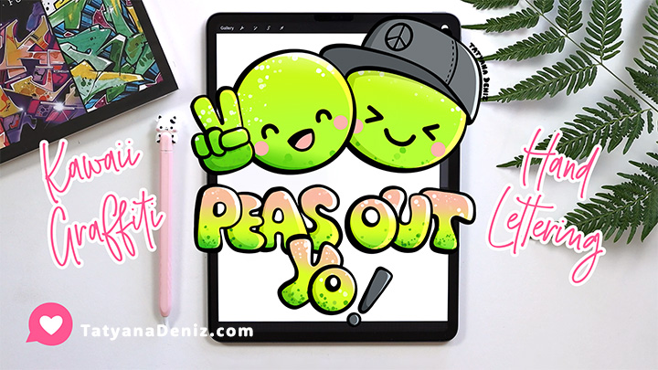
And there you have it! Our drawing now looks super cute and nicely balanced with the text. I’m thrilled with how it turned out. What do you think? 😊
Get This Kawaii Pun on a T-shirt
If you’re like this kawaii pun “Peas Out” design, get it on a t-shirt. You will love it!
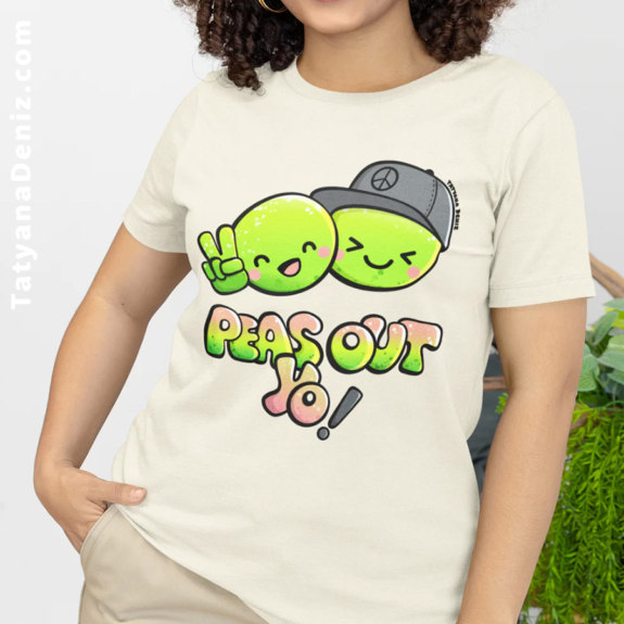
👉 Get This T-shirt 👈
Hear from Fellow Creators
Here is what Vicky Bloom said about my Procreate brushes. 👇

More Tutorials
If you enjoyed this tutorial, you will also love:
- Smooth Lines in Procreate
- Color Tools in Procreate
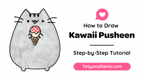
- How to Draw Kawaii Faces
- How to Use Drawing References Without Copying
Join Our Facebook Group
Join our safe and friendly community on Facebook to share your kawaii art, get feedback, and connect with like-minded creatives. Create, share, and celebrate cuteness together!
Share the Love
Help me share creative goodness by sharing this tutorial with your friends using the buttons below. 👇 Let’s co-create together! ❤️